Introduction
For too long typographic style and its accompanying attention to detail have been overlooked by website designers, particularly in body copy. In years gone by this could have been put down to the technology, but now the web has caught up. The advent of much improved browsers, text rendering and high resolution screens, combine to negate technology as an excuse.
Robert Bringhurst’s book The Elements of Typographic Style is on many a designer’s bookshelf and is considered to be a classic in the field. Indeed the renowned typographer Hermann Zapf proclaims the book to be a must for everybody in the graphic arts, and especially for our new friends entering the field.
In order to allay some of the myths surrounding typography on the web, I have structured this website to step through Bringhurst’s working principles, explaining how to accomplish each using techniques available in HTML and CSS. The future is considered with coverage of CSS3, and practicality is ever present with workarounds, alternatives and compromises for less able browsers.
At the time of writing, this is a work in progress. I am adding to the site in the order presented in Bringhurst’s book, one principle at a time.
I am excluding those principles which are not relevant to the Web or that do not require a technical explanation. Unfortunately this excludes the entire opening chapter, the Grand Design, which I heartily recommend you read as it lays down the foundations, philosophy and approach to good typography in any medium. If you were to take any working principle from the Grand Design, it would be this: Give full typographical attention even to incidental details.
Now start with Rhythm & Proportion or dip into the Table of Contents and enjoy pushing a few boundaries to create websites of real typographical worth.
— Richard Rutter, Brighton, December 2005.
Postscript
In February 2014, I opened up the source code to this website on GitHub, with an invitation to web typography enthusiasts to take on the project, update the content and add the missing items. I will continue to maintain the website and update as changes are submitted.
This website is licensed under a Creative Commons Attribution-NonCommercial 4.0 International License. It was created and is maintained by Richard Rutter. Please feel free to contribute by forking it on GitHub.
Rhythm & Proportion
Horizontal Motion
Define the word space to suit the size and natural letterfit of the font
If text is set ragged right, the word space (the space between words) can be fixed and unchanging. If the text is justified (set flush left and right), the word space must be elastic. In either case the size of the ideal word space varies from one circumstance to another, depending on factors such as letterfit, type color, and size. A loosely fitted or bold face will need a larger interval between the words. At larger sizes, when letterfit is tightened, the spacing of words can be tightened as well.
In CSS, word space is set with the word-spacing property which has a default value of normal. The default word space is equivalent to approximately 0.25 em, although the exact value will depend on information encoded within the digital font file. To change the word spacing, you should specify a length in ems. This length is added to the existing word space; that is to say word-spacing does not set the actual space between words, it sets an increment to the existing spacing. For example:
p {
  word-spacing: 0.25em;
}

h1 {
  word-spacing: -0.125em;
}
In the preceding example, word space in paragraphs is increased by 0.25 em (effectively doubling it) and the word space in top level headings is decreased by 0.125 em (effectively halving it).
While in theory you could specify word-spacing in pixels or any other allowable unit of length, it is important to specify word-spacing in ems as that is the only way to guarantee the word space changes proportionately to the text size (when readers change their default text size, for example).
An explanation of ems
Ems are so-called because they are thought to approximate the size of an uppercase letter M (and so are pronounced emm
), although 1 em is actually significantly larger than this. Bringhurst describes the em thus:
The em is a sliding measure. One em is a distance equal to the type size. In 6 point type, an em is 6 points; in 12 point type an em is 12 points and in 60 point type an em is 60 points. Thus a one em space is proportionately the same in any size.
To illustrate this principle in terms of CSS, consider these styles:
#box1 {
  font-size: 22px;
  width:  1em;
  height: 1em;
  border: 2px solid black;
}

#box2 {
  font-size: 55px;
  width:  1em;
  height: 1em;
  border: 2px solid black;
}
These styles will render like:
Note that both boxes have a height and width of 1 em but because they have different font sizes, one box is bigger than the other. Box 1 has a font-size of 22 px so its width and height is also 22 px; similarly the text of box 2 is set to 55 px and so its width and height are also 55 px.
Choose a comfortable measure
Anything from 45 to 75 characters is widely regarded as a satisfactory length of line for a single-column page set in a serifed text face in a text size. The 66-character line (counting both letters and spaces) is widely regarded as ideal. For multiple column work, a better average is 40 to 50 characters.
The measure is the number of characters in a single line of a column of text. HTML doesn’t have a concept of columns per se, instead text is held within boxes. In CSS the width of a box is set using the width property with any unit of length, for example:
#col1 {
  width: 400px;
}

#col2 {
  width: 50%;
}

#col3 {
  width: 33em;
}
When typographers set the measure and text size for printed media, those dimensions are fixed and unchangeable in their physical manifestation. In this regard, the Web as viewed on-screen is fundamentally different to print because the medium is far more under the control of your readers. In particular, if your reader wishes to change the text size or the dimensions of the ‘page’, he can do.
In the preceding example, column 1 has a fixed width: it has been set to 400 px wide. With text rendering at 12 px this would result in a measure of approximately 66 characters per line. If your reader increases the text size to 16 px then the measure reduces to 50 characters per line. Thus when the text size is changed, so the measure changes.
Column 2 has a liquid width: it has been set to 50% wide. Assuming your reader is browsing with a window 1000 px wide, the box would be rendered as 500 px wide, resulting in a measure of about 83 characters per line. A measure of 83 may be a little too wide for your reader, but because the box is liquid, your reader could reduce their window size to 800 px, thus narrowing the box to 400 px and creating a more comfortable measure of 66 characters per line.
Column 3 has an elastic width: it has been set to 33 em wide. On average one character takes up 0.5 em so this box will have a measure of 66 characters per line. If your reader increases the text size, the width of box will increase accordingly and so the measure remains at 66 regardless of the text size.
From a typographical perspective, the most appropriate method is to set box width in ems (elastic layout) as it ensures the measure is always set to the typographer’s specification. Setting box width as a percentage (liquid layout) gives the typographer approximate control over measure but also allows the reader to adjust the layout to suit his or her comfort.
Relinquishing such control makes some designers quake in their boots, but the beauty and advantage of the Web as a medium is that readers are able to adjust their reading environment to suit their own needs. This is a concept that should be acknowledged & embraced, and built into website designs from the ground up.
Set ragged if ragged setting suits the text and page
In justified text, there is always a trade-off between evenness of word spacing and frequency of hyphenation.
Narrow measures – which prevent good justification – are commonly used when the text is set in multiple columns. Setting ragged right under these conditions will lighten the page and decrease its stiffness.
Many unserifed faces look best when set ragged no matter what the length of the measure. And mono-spaced fonts, which are common on typewriters, always look better set ragged.
Setting text justified or ragged is accomplished in CSS through the text-align property, as follows:
p {
  text-align: left;  /* ragged right */
}

p {
  text-align: right; /* ragged left  */
}

p {
  text-align: justify;
}
Effective justification of text can only be achieved if long words are hyphenated. HTML and CSS 2 do not have any provision for automatic hyphenation and current Web browsers support, even for manual hyphenation, is poor.
Future considerations
CSS3 provides further refinement of justification within the Text Module. For European languages, the text-justify property provides two justification options: inter-word and inter-character.
Setting inter-word selects the simplest and fastest full justification behaviour, which spreads the text evenly across the line by increasing the width of the space between words only. No expansion or compression occurs within the words, i.e. no additional letter spacing is created.
Setting inter-character selects the justification behaviour in which both inter-word and inter-letter spacing can be expanded or reduced to spread the text across the whole line. This is the significantly slower and more sophisticated type of the full justify behaviour preferred in newspaper and magazines. Typically, compression is tried first. If unsuccessful, expansion occurs: inter-word spaces are expanded up to a threshold, and finally inter-letter expansion is performed. For example:
p {
  text-align: justify;
  text-justify: inter-character;
}
CSS3 also provides last line alignment with the text-align-last property. Normally the last line in a paragraph of justified text would not be justified, however if text-align-last is set to justify then the last line will be also spread evenly across the line, although in most cases this would be highly undesirable from a typographical perspective.
A potentially more useful purpose for text-align-last, at least for display text, is to set it to size. With size selected, the line content is scaled to fit on the line, so a line with fewer characters will be displayed in a larger font.
Use a single word space between sentences
In the nineteenth century, which was a dark and inflationary age in typography and type design, many compositors were encouraged to stuff extra space between sentences. Generations of twentieth century typists were then taught to do the same, by hitting the spacebar twice after every period [full stop]. Your typing as well as your typesetting will benefit from unlearning this quaint Victorian habit. As a general rule, no more than a single space is required after a period, colon or any other mark of punctuation.
All white space in HTML, in any combination of spaces, tabs or line breaks, is automatically collapsed to a single word space. Therefore this guideline is automatically adhered to regardless of your training as a typist.
If you do need to insert more than a single word space between sentences, or any other characters, then use one of the many space characters available in Unicode. Even if the character itself isn’t included in the current font, Unicode-aware browsers will display a good approximation. Avoid the temptation to use a non-breaking space, , as this has a meaning in and of itself.
 en space em space 3-per-em space 4-per-em space 6-per-em space figure space punctuation space thin space hair space
Another method would be to apply the white-space:pre property in CSS to retain the white space formatting. However if you are using white space to format a passage of text, for instance computer code or poetry, then you should enclose the passage in a pre element as this is a more semantic way to preserve the white space pre-formatting.
Add little or no space within strings of initials
Names such as W.B. Yeats and J.C.L. Prillwitz need hair spaces, thin spaces or no spaces at all after the intermediary periods [full stops]. A normal word space follows the last period in the string.
Hair spaces and thin spaces are two of the many space characters available in Unicode. Even if the character itself isn’t included in the current font, Unicode-aware browsers will display a good approximation. Here’s how to use hair spaces and thin spaces, respectively:
W. B. Yeats
J. C. L. Prillwitz
Which renders as W. B. Yeats and J. C. L. Prillwitz. Unfortunately some browsers which are less Unicode-aware will show square placeholder symbols instead of the required spaces, so until support improves, no space at all is probably the way to go in this instance.
Letterspace all strings of capitals and small caps, and all long strings of digits
Acronyms such as CIA and PLO are frequent in some texts. So are abbreviations such as CE and BCE or AD and BC. The normal value for letterspacing these sequences of small or full caps is 5% to 10% of the type size.
Many typographers like to letterspace all strings of numbers as well. Spacing is essential for rapid reading of long, fundamentally meaningless strings such as serial numbers, and is helpful even for shorter strings such as phone numbers and dates.
Letter spacing in CSS is achieved with the aptly named letter-spacing property. To letter space abbreviations at 10% of the type size you could wrap the abbreviations in <abbr> tags and apply a CSS rule such as:
abbr {
  letter-spacing: 0.1em;
}
If you have created static pages for your website then inserting <acronym> and <abbr> elements where appropriate might be slightly tedious but probably feasible. Dealing with text delivered by a content management system, however, is a different kettle of fish and would need some sort of automation. At this point your CMS developer would probably turn to regular expressions.
I’m not going to explain regular expressions here – there are plenty of resources elsewhere on the web – but in the form of a PHP function here is an expression to get you started:
$search = '/\b([A-Z][A-Z0-9]{2,})\b/';
$replace = '<abbr>$1</abbr>';
$text = preg_replace($search,$replace,$text);
This function looks for sequences of 3 or more uppercase letters or numbers, such as CSS, HTML and W3C, and wraps an <abbr> tag around them.
Don’t letterspace the lower case without a reason
A man who would letterspace lower case would steal sheep, Frederic Goudy liked to say. The reason for not letterspacing lower case is that it hampers legibility. But there are some lowercase alphabets to which this principle doesn’t apply. Moderate letterspacing can make a face such as lowercase Univers bold condensed more legible rather than less.
Letterspacing lower case on the Web is particularly risky as only some faces actually benefit from the treatment, and you can rarely guarantee which type face you will actually be transforming.
There are however some fairly common typefaces to which letterspacing could be applied. Vaguely similar to the Univers bold condensed mentioned by Bringhurst are Impact and Haettenschweiler. These faces would only be used for headings and could be letterspaced using the letter-spacing property as follows:
h2 {
  font-family: "univers bold condensed",
    impact, haettenschweiler, sans-serif;
  font-size: 200%;
  letter-spacing: 0.1em;
}
This would render as follows:
Notice that the letter-spacing is specified in ems to ensure that the amount of kerning is applied in proportion to the text size.
Kern consistently and modestly or not at all
Kerning – altering the space between selected pairs of letters – can increase consistency of spacing in a word like Washington or Toronto, where the combinations Wa and To are kerned.
At present there is no mechanism within HTML or CSS that specifically enables kerning. However text on the Web does not generally need manual kerning, as all digital fonts have kerning tables built-in. These tables define which letter pairs need adjusting and by how much, and are usually adhered to by operating systems. The only time manual kerning may prove necessary is with larger text such as that in headings, in particular when numbers, italics or punctuation are involved.
It is also important to bear in mind that letter pairs in one font of your font-family list may need kerning whereas in another font they do not. In this case it is advisable not to kern, as too much kerning is almost always worse than none at all.
Where you do wish to kern letter pairs, you must insert a neutral inline element, such as span and apply the letter-spacing property. For example:
<span class="kern">W</span>ashington
and <span class="kern">T</span>oronto

<style> .kern { letter-spacing: -0.1em; } </style>
Which should render as:
Notice that the span was applied around the first letter of the pair, not around both letters. This is because the letter-spacing property adds or removes space after each letter. Notice also that the letter-spacing is specified in ems to ensure that the amount of kerning is applied in proportion to the text size.
As with letterspacing strings of capitals, adding a span every time you need to kern a letter pair could become tedious and so regular expressions could come to the rescue once more. This PHP function uses a regular expression to replace insert a span into any string of ‘To’ or ‘Wa’:
$search = '/(T)(o)|(W)(a)/';
$replace = '<span class="kern">$1$3</span>$2$4';
$text = preg_replace($search,$replace,$text);
The Future
The CSS3 Text Module may contain the kerning-mode and kerning-pair-threshold properties to aid control over kerning, although these properties have yet to be fully defined.
Don’t alter the widths or shapes of letters without cause
In the world of digital type, it is very easy for a designer or compositor with no regard for letters to squish them into cattle trains and ship them to slaughter.
CSS does not offer many opportunities for altering the width or shapes of letters. In fact only the letter-spacing property can be applied at all for this purpose, and that simply changes the width of the letters (but not their shape). The letter-spacing property can however be particularly destructive. Consider this maltreatment of a heading:
<h2 class="squish">letterfit</h2>

<style> h2.squish { letter-spacing: -0.1em; } </style>
Resulting in:
The result may differentiate itself stylistically from other websites, and that might be fine if the words are not important; legibility is the real loser in this instance.
Don’t stretch the space until it breaks
Lists, such as contents pages and recipes, are opportunities to build architectural structures in which space between the elements both separates and binds. The two favourite ways of destroying such an opportunity are setting great chasms of space that the eye cannot leap without help from the hand, and setting unenlightening rows of dots that force the eye to walk the width of the page like a prisoner being escorted back to its cell.
The dot leader approach to which Bringhurst alludes is the default presentation for tables of contents in Microsoft Word. Fortunately this kind of layout is tricky to accomplish in CSS so it is rarely seen in web pages. Bringhurst goes on to present two alternative layouts for tables of contents which are replicated here:
Example 1 – Table of contents aligned right
| Introduction | 7 |
|---|---|
| Chapter 1 The Sex of Centaurs | 11 |
| Chapter 2 Poliphilo’s Dream | 11 |
This is a table of contents so it has been marked up as a simple table:
<table>
<tr>
<th>Introduction</th>
<td>7</td>
</tr>
<tr>
<th>
Chapter <strong>1</strong>
The Sex of Centaurs
</th>
<td>11</td>
</tr>
<tr>
<th>
Chapter <strong>2</strong>
Poliphilo’s Dream
</th>
<td>11</td>
</tr>
</table>The CSS looks like this:
table {
  margin: 0 3em 0 auto;
}

th {
  font-weight: normal;
  text-align: right;
  padding: 0;
}

td {
  font-style: italic;
  text-align: right;
  padding: 0 0 0 0.5em;
}
While most of the CSS is straight forward, a point worth highlighting is the margin declaration for the table itself. There is a right margin of 3 em to set the table in slightly from the right gutter and a left margin of auto to push the table over towards the right hand side of the page.
Example 2 – Centred table of contents
| Prologue | page 5 |
|---|---|
| Points of Possible Agreement | page 9 |
| Irreconcilable Differences | page 11 |
| Conclusion | page 163 |
| Index | page 164 |
Again a simple table has been used for the markup:
<table>
  <tr><th>Prologue</th><td>page 5</td></tr>
  <tr><th>Points of Possible Agreement</th>
      <td>page 9</td></tr>
  <tr><th>Irreconcilable Differences</th>
      <td>page 11</td></tr>
  <tr><th>Conclusion</th><td>page 163</td></tr>
  <tr><th>Index</th><td>page 164</td></tr>
</table>
The CSS looks like this:
table {
  margin: 0 auto;
}

th {
  font-weight: normal;
  text-align: right;
  padding: 0 0.5em 0 0;
}

td:before {
  content: "2022";
  padding-right: 0.5em;
}

td {
  font-style: italic;
  text-align: left;
  padding: 0;
}
There a couple of points worth noting in the CSS. The table has been centered by giving the left and right margins a value of auto. For block-level elements a width declaration would also be required when applying this technique, however tables have an inherent width so one does not need to be specified explicitly.
The bullet points separating chapter titles and page numbers have been generated by the CSS. Specifically a bullet point (Unicode character 2022) has been inserted before the td element.
Vertical Motion
Choose a basic leading that suits the typeface, text and measure
Vertical space is metered in a different way [to horizontal space]. You must choose not only the overall measure – the depth of the column or page – but also a basic rhythmical unit. This unit is the leading, which is the distance from one baseline to the next.
Leading (pronounced “ledding”) is so called because, in mechanical presses, strips of lead are placed between lines of type to space the lines apart. Leading is achieved in CSS through the line-height property. For example 12 point text can be given 3 points of lead in the following manner:
p {
  font-size: 12pt;
  line-height: 15pt;
}
However that example is bad as line-height should never be applied using absolute units such as points or pixels. In the prior example, when text is resized in a browser, the font-size increases (to 18 pt for example) but the line-height may remain at 15 pt. So instead of the lines being spaced apart, they would actually overlap.
A better approach is to make use of a unique characteristic of the line-height property: it is the only CSS property for which non-zero numeric values are allowed without units. The preceding example could also be coded as:
p {
  font-size: 12pt;
  line-height: 1.25;
}
In this example the value of line-height is a multiplier: 1.25 × 12 = 15 pt. This is a far more reliable method as the line-height (the distance between baselines) will always be proportional to the text size. Line height can be incorporated into the font property using a shorthand familiar to typographers:
p {
  font: 12pt/1.25 "Minion Pro", "Minion Web", serif;
}
It should be noted that some browsers add a little leading by default: Safari and Internet Explorers for example; whereas others, such as Camino and Firefox, do not. Text on the web almost always benefits from an increase in line height, and figures upwards of 1.3 are common (this page has a line-height of 1.5 for example).
Unlike in mechanical presses, where one line of lead is added below the text, the spacing added on the Web is divided equally above and below the text. To illustrate this the following example has a line-height of 3 and shows the text set midway between two borders:
Negative leading, in other words a line-height value of less than 1, can be used on short pieces of text provided care is taken to ensure ascenders and descenders do not collide. For example:
.example {
  font-size: 1.5em;
  line-height: 0.85;
  text-indent: -0.5em;
}of negative leading
Add and delete vertical space in measured intervals
Headings, subheads, block quotations, footnotes, illustrations, captions and other intrusions into the text create syncopations and variations against the base rhythm of regularly leaded lines. These variations can and should add life to the page, but the main text should also return after each variation precisely on beat and in phase.
The most common addition of vertical space on a webpage is that inserted between paragraphs. If the rhythm of the page is to be maintained, the spacing of paragraphs should be related to the basic leading. For example, the text on this page is set at 22 px with a line-height of 1.5 em, making each line 33 px in height. In order to keep the rhythm of the text, the vertical spacing between blocks should also be 33 px. This is achieved by setting top- and bottom-margins equal to the line height.
p {
  line-height:   1.5;
  margin-top:    1.5em;
  margin-bottom: 1.5em;
}
It should be noted that the default treatment by web browsers of paragraphs (and other block level elements such as blockquotes and lists) is to insert a top- and bottom-margin of 1 em. The implication is that margins must always be specified by the designer.
Variations in text size
When there is a change in text size, perhaps with a heading or sidenotes, the differing text should take up a multiple of the basic leading. As stated earlier, each line on this page is 33 px in height. This means that every diversion from the basic text size should take up multiples of 33 px. This can be accomplished by adjusting the line-height and margin accordingly.
Headings
The subheadings on this page are set to 27.5 px. In order that the height of each line is 33 px, the line-height should be set to 33 ÷ 27.5 = 1.2. Similarly the margins above and below the heading must be adjusted. The temptation is to set heading margins to a simple 1 em, or leave them at the browser default, but this would usually result in breaking the rhythm of the text. In the case of this page, the top and bottom margins are the same size and equal to a full line, so they too should be set at 1.2 em.
h2 {
  line-height:   1.2;
  margin-top:    1.2em;
  margin-bottom: 1.2em;
}
One can also set asymmetrical margins for headings, provided the margins combine to be multiples of the basic line height. For example, a top margin of 1.5 lines could be combined with a bottom margin of half a line as follows:
h2 {
  line-height: 1.2;
  margin-top: 1.8em;
  margin-bottom: 0.6em;
}
Sidenotes
Sidenotes (and footnotes for that matter) are often set at a smaller size to the basic text. This smaller text should still form a rhythm with the basic text, so a calculation similar to that of headings, is required. Consider the following example:
Daniel is roused by a rooster on the forecastle* deck that is growing certain it’s not just imagining the light in the eastern sky. Unfortunately the eastern light is off to port this morning. Yesterday it was to starboard. Minerva has been sailing up and down the New England coast for the better part of a fortnight, trying to catch a wind that will decisively take her out into the deep water.
The forecastledeck is the short deck that, towards the ship’s bow, is built above the upperdeck.
The main body text again has a text size of 22 px and a line height of 33 px. The sidenotes are set at 18.33 px and so their line-height must be increased to 33 ÷ 18.33 = 1.8.
Images
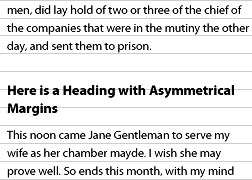
On the Web, images in sidebars and within the main body of text are almost always guilty of disrupting the rhythm of text. The same rules should be applied to images as to headings: any image and associated caption should take up multiples of the basic line height.
For example, the image on this page demonstrating asymmetrical headings is 180 px tall – approximately 5.5 lines in height. Clearly this would ordinarily cause problems to arise. However, with the help of a simple JavaScript library, the margins have been automatically adjusted so that the image occupies precisely 6 lines.
Blocks & Paragraphs
Set opening paragraphs flush left
The function of a paragraph indent is to mark a pause, setting the paragraph apart from what precedes it. If a paragraph is preceded by a title or subhead, the indent is superfluous and can therefore be omitted.
Paragraphs, and other block level elements, are indented using the text-indent property. To ensure a paragraph is set flush left, the text-indent should be set to zero:
p {
  text-indent: 0;
}
This rule is rarely necessary, however, because CSS specifies that the default initial value for text-indent should be 0.
In continuous text mark all paragraphs after the first with an indent of at least one en
Ornaments […] drop lines […] outdented paragraphs […] and others, have their uses but the plainest, most unmistakable yet unobtrusive way of marking paragraphs is the simple indent.
Indenting the first line of a paragraph, or any block element is achieved in CSS using the text-indent property:
p {
  text-indent: 1em;
}
The preceding rule will indent every paragraph, however we only wish to indent paragraphs that follow another paragraph. To achieve this, an adjacent sibling selector (+) can be used:
p + p {
  text-indent: 1em;
}
Further, the line space between paragraphs which most browsers insert by default should be removed. Browsers create this line break by adding a top and bottom margin to paragraphs; the bottom margin should be removed from all paragraphs, and the top margin removed from those paragraphs which follow another paragraph:
p {
  margin-bottom: 0;
}
p + p {
  text-indent: 1em;
  margin-top: 0;
}
There is no limit to how much you indent by, but you may wish to start by describing a square. This can be achieved by setting your indent to the same value as your line-height.
Indentation is not the only way to indicate a paragraph. The many alternatives include: simple block paragraphs, outdenting, ornamented indents, ornamentation within a continuous stream, or droplines.
Block Paragraphs
As stated earlier, block paragraphs – paragraphs separated by line breaks – are the default method used by web browsers. As explained in §2.2.2 the margins separating paragraphs should be set equal to the line-height in order that the rhythm of the text is maintained.
Outdenting
Marking paragraphs by outdenting them into the margin is achieved in the same manner as indenting: simply use a negative number for the indent.
p {
  margin-bottom: 0;
}
p + p {
  text-indent: -1em;
  margin-top: 0;
}
Ornaments
Ornamented indentation, unlike standard indentation, does not necessarily require the use of text-indent to achieve the primary effect (although it can aid clarity). The key to achieving this effect is the use of the CSS 2.1 :before pseudo-element to specify the ornamentation. The following example would insert a floral heart at the beginning of a subsequent paragraph:
p {
  margin-bottom: 0;
}
p + p:before {
  content: "2767";
  padding-right: 0.4em;
  margin-top: 0;
}
In the above example, applying a text-indent to the paragraph would cause the ornament to be indented with the first line of the paragraph; to separate the ornament from the content, padding-right has been applied to the generated content.
Another use of ornaments as paragraph markers is to have a continuous stream of text with paragraphs separated by ornaments. To achieve this, the paragraphs should be set to display as inline elements, with ornamentation specified as before (in this case a decorative pilcrow is used in place of the floral heart bullet):
p { display: inline; }
p + p:before {
  content: "2761";
  padding-right: 0.1em;
  padding-left: 0.4em;
}
Droplines
Dropline paragraphs start one line down, at the horizontal place on the page that the previous paragraph finished. Unlike other styles mentioned, dropline paragraphs for long pieces of text are impossible to achieve consistently in CSS without exorbitantly long CSS files or (preferably) the aid of JavaScript.
A technique that can be applied is similar to that used for a continuous stream of text, in that it uses display:inline to achieve the horizontal positioning. Once the paragraphs are positioned horizontally, a relative top position equal to the line height applied to subsequent paragraphs can create the desired vertical positioning (and thus the full drop line effect):
p {
  display: inline;
  position: relative;
}
p + p { top: 1.3em; }
The problem with this approach is that the vertical positioning is not relative to the previous paragraph, only the parent box, and so all paragraphs after the first dropped paragraph appear to simply be part of a continuous stream of text. To achieve the full effect requires that each subsequent paragraph have a multiple of the original top position:
p {
  display: inline;
  position: relative;
}
p + p { top: 1.3em; }
p + p + p { top: 2.6em; }
p + p + p + p { top: 3.9em; }
Specifying top positions this way is clearly unwieldy, and a perfectly reasonable candidate for implementing in JavaScript. The technique might be applicable to display material where there are only short runs of text.
Add extra lead before and after block quotations
However the block quotations are set, there must be a visual distinction between main text and quotation, and again between the quotation and subsequent text.
Adding a gap between a block quotation and the main text is best achieved by applying a top and bottom margin to the blockquote. By default, browsers usually apply a left and right margin as well. You may wish to remove this altogether by setting the margins to zero. If you wish to retain the indent, a more consistent layout can be achieved by applying left and right margins equal to the top and bottom margins.
blockquote {
  margin: 1.5em;
}
As explained in §2.2.2, the margins should be sized so that the rhythm of the text is maintained. Where the blockquote text size is the same as the main text, the separating margins should be set equal to the line-height.
Indent or center verse quotations
Verse is usually set flush left and ragged right, and verse quotations within prose should not be deprived of their chosen form. But to distinguish verse quotations from surrounding prose, they should be indented or centered on the longest line.
When setting verse, whether on the web or otherwise, the primary concern is not to deprive it of its “chosen form”, including matters of spacing and visual structure (as this is considered, in many poetic works, to be at least as important as the words themselves). As such, a pre (pre-formatted) element is most apt to setting verse.
<blockquote class="verse">
<pre>God guard me from those thoughts men think
In the mind alone;
He that sings a lasting song
Thinks in a marrow bone.</pre>
</blockquote>
In its default state the pre element is usually rendered using a monospaced font, so this should normally be changed to a more fitting typeface. Setting the font-family to inherit the typeface from the surrounding text may be a good start:
.verse pre {
  font-family: inherit;
}
A logical way to center the verse on the longest line would be to simply specify width:auto and margin:0 auto. Unfortunately, due to browsers’ rendering of preformatted elements, the element will still be considered to comprise full-width lines, so no centering will occur. However we can work around this by specifying the pre element to display as a table as follows:
.verse pre {
  font-family: inherit;
  display: table;
  width: auto;
  margin: 0 auto;
}
The preceding rules achieve the desired layout in Firefox, Safari and Opera 9. However margin:0 auto will not center elements in Internet Explorer 6 or 7, without a specific width being set. To work around this, a new span element containing the entire block of verse must be nested within the pre element as follows:
<blockquote class="verse">
<pre><span>God guard me from those thoughts men think
In the mind alone;
He that sings a lasting song
Thinks in a marrow bone.</span></pre>
</blockquote>
This span can then be centered in Internet Explorer applying text-align:center to the pre and resetting the text alignment on the span element.
.verse pre {
  text-align: center;
}

.verse pre span {
  text-align: left;
}
Much like other browsers, Internet Explorer considers any preformatted content to have full-width lines; to counter this, the span can be set to display:inline-block. This in turn causes Internet Explorer to ignore white-space formatting, so we must re-set the span to white-space:pre. This gives us:
.verse pre {
  text-align: center;
}

.verse pre span {
  text-align: left;
  display: inline-block;
  white-space: pre;
}
The display:inline-block in the preceding rule causes Gecko-based browsers such as Firefox and Camino to incorrectly render the contents. Fortunately these rules are only required for Internet Explorer, so we can write them in a separate style sheet, included using conditional comments (see Quirksmode for more info):
<!--[if lte IE 7]>
<link rel="stylesheet" type="text/css" href="ie-lte-7.css" />
<![endif]-->
Here’s the final rendered example of prose, set flush left & ragged right, and centered on the longest line:
God guard me from those thoughts men think
In the mind alone;
He that sings a lasting song
Thinks in a marrow bone.
Etiquette of Hyphenation & Pagination
At hyphenated line-ends, leave at least two characters behind and take at least three forward
Fi-nally is a conventionally acceptable line-end hyphenation, but final-ly is not, because it takes too little of the word ahead to the next line.
Unlike much word processing and page-layout software, there is not yet any automatic hyphenation built into web browsers. The next best method is to insert hyphen characters manually, or with the aid of a JavaScript library.
Liquid layouts and resizable text mean that, on the Web, one never knows which word will be at the end of a line. To deal with this in HTML, there are two types of hyphens: the plain hyphen and the soft hyphen. Browsers treat the plain hyphen as just another character. The soft hyphen tells the browser where a word break can occur, and should only be displayed when a word is being broken across two lines.
The soft hyphen has existed since HTML 3.2, and is explained well in the HTML 4.0 recommendation. Its entity code is ­ or ­ and is used as follows:
anti­dis­est­ab­lish­ment­arian­ismWhich renders in your browser as: antidisestablishmentarianism antidisestablishmentarianism antidisestablishmentarianism.
By definition, a soft hyphen should only appear when the word is wrapped. Browser support for this was patchy, but the situation has improved recently.
The Future
Until recently, the CSS3 Text module contained the hyphenate property which could be set to auto or none. This property introduced the concept of automatic hyphenation to browsers, and would require that the web browser has a hyphenation dictionary for the language of the text being hyphenated. For example:
p {
  hyphenate: auto;
}
At the time of writing, the latest Working Draft of March 2007, states that the definition of the hyphenation feature is still very much up-in-the-air, but it’s likely that advanced hyphenation controls will be introduced. The CSS3 Paged Media module has more details of the hyphenation properties originally proposed, among these are the hyphenate-before and hyphenate-after properties which specify the minimum number of characters in a hyphenated word before and after the hyphenation character. For example:
p {
  hyphenate-before: 2;
  hyphenate-after: 3;
}
Avoid more than three consecutive hyphenated lines
This guideline can be achieved easily when hyphenating manually. See §2.4.1 for more information on manual hypenation.
The Future
Hyphenation will be included in the CSS3 Text module, but at the time of writing, the definition of the hyphenation feature is still very much up-in-the-air. Currently the CSS3 Paged Media module has more details of the hyphenation properties originally proposed, and among these is the hyphenate-lines property which specifies the maximum number of successive hyphenated lines in an element. For example:
p {
  hyphenate: auto;
  hyphenate-lines: 3;
}
A value of none means that there is no limit to the number of successive hyphenated lines.
Hyphenate according to the conventions of the language
In English one hyphenates cab-ri-o-let but in French ca-brio-let. The conventions of the individual language should, ideally, be followed even for single foreign words or brief quotations.
This guideline can be achieved on the Web when hyphenating manually. See §2.4.1 for more information on manual hyphenation.
The Future
Hyphenation will be included in the CSS3 Text module, but at the time of writing, the definition of the hyphenation feature is still very much up-in-the-air. Currently the CSS3 Paged Media module has more details of the hyphenation properties originally proposed.
The choice of which hyphenation dictionary to use should be automatic depending on the natural language of the document. The document language should ordinarily be specified in the HTTP header, but can also be identified with markup:
<html lang="en"> ... </html>The CSS3 Text module may also introduce a hyphenate-dictionary property to specify which hyphenation dictionary to use. For example:
html[lang=en] {
  hyphenate-dictionary:url(hyph_en.dic);
}
html[lang=fr] {
  hyphenate-dictionary:url(hyph_fr.dic);
}
A value of auto would indicate that the built-in dictionaries, if any, should be used.
Link short numerical and mathematical expressions with hard spaces
Hard spaces are useful for preventing line-breaks within phrases such as 6.2 mm, 3 in., 4 × 4, or in phrases like page 3 and chapter 5.
In HTML the hard space character is known as a non-breaking space and is inserted using the entity , for example:
1 inch is equivalent to 2.54 cm.It should not really be expected of authors to type everytime a non-breaking space is required. This is a job that, to some degree, can be performed automatically by a content management system. To demonstrate this by way of simple PHP example, a regular expression function could automatically insert non-breaking spaces as follows:
$search = '/([0-9]) ([a-zA-Z])/';
$replace = '$1 $2';
$text = preg_replace($search,$replace,$text);
This function looks for sequences of a number followed by a space followed by a letter and replaces the space with a non-breaking space. This would deal with instances such as 2.54 cm. For phrases like chapter 5 it would be better to create a set of watch-words rather than attaching every number to a preceding string. Additionally rules would need to be created to handle common mathematical operators as in 4 × 4.
Never begin a page with the last line of a multi-line paragraph
The stub-ends left when paragraphs end on the first line of a page are called widows. They have a past but not a future, and they look foreshortened and forlorn.
Comprehensive control for page breaks was introduced in CSS 2. The page-break-before and page-break-after properties enable you to say that a page break should occur before or after the specified element. The following example starts a new page everytime an h1 heading is encountered and after every .section block.
h1 {
  page-break-before: always;
}
.section {
  page-break-after: always;
}
If you know (or can calculate) when a paragraph will be split over two pages, you could achieve some crude widow and orphan control by giving that paragraph a relevant class and forcing a page break before it, for example:
.dontsplit {
  page-break-before: always;
}
In reality that is not a likely situation and would always be problematic if readers set their browsers to print out different size text, or use different size paper, to your assumptions.
The Future
In essence widow and orphan control is not currently possible for the vast majority of people. However CSS 2 support will increase with time so if you are writing a print style sheet it is worth considering the properties already specified in CSS 2.
A relative of the page-break-after property mentioned earlier is page-break-inside which stops elements spanning pages. For example you may like to apply this rule to all headings:
h1, h2, h3, h4, h5, h6 {
  page-break-inside: never;
}
Precise widow and orphan control is also available through the widows and orphans properties. The value of the property is the minimum number of lines which is allowed to be widowed or orphaned. For example you can prevent less than four lines of a paragraph being left behind or printed on a new page using the following:
p {
  widows: 4;
  orphans: 4;
}
Harmony & Counterpoint
Size
Don’t compose without a scale
In the sixteenth century, a series of common sizes developed among European typographers, and the series survived with little change and few additions for 400 years. […] Use the old familiar scale, or use new scales of your own devising, but limit yourself, at first, to a modest set of distinct and related intervals.
Sizing text in CSS is achieved using the font-size property. In print, font sizes are specified absolutely, for example setting text at 12 points implies a particular physical height for the printed text. On the web, font sizes can be set absolutely or relatively, and in a number of different units. What’s more, most web browsers enable the reader to resize the text to suit their own reading environment and requirements.
For text which is to be printed, the font-size property can and should be used to set in text in points, for example:
p { font-size: 12pt; }For text which is to be read on screen, the situation is slightly more complicated. Arguably the most appropriate unit is pixels which is a unit relative to the screen resolution. Setting text sizes in pixels gives web designers precision similar to that afforded to print designers. However, some web browsers does not allow readers to resize text set in pixels, so we need to look to other units.
Sizing text using the em unit is the next most appropriate approach. The em is a true typographic unit and was recommended by the W3C from the outset of CSS. Ems are a relative unit and act as multipliers based on the text element’s parent element. Thus, if the body of a web page has 16 px text by default, making paragraphs render at 12 px would require setting paragraphs at 0.75em.
p { font-size:0.75em; /* 16x0.75=12 */ }So choosing from the traditional scale, our final font sizing style sheet could look as follows:
body { font-size: 100%; }
h1 { font-size: 2.250em; /* 16x2.250=36 */ }
h2 { font-size: 1.500em; /* 16x1.500=24 */ }
h3 { font-size: 1.125em; /* 16x1.125=18 */ }
h4 { font-size: 0.875em; /* 16x0.875=14 */ }
p  { font-size: 0.750em; /* 16x0.750=12 */ }
More details and analysis of font sizing can be found in How to Size Text in CSS.
Numerals, Capitals & Small Caps
Use titling figures with full caps, and text figures in all other circumstances
When arabic numerals joined the roman alphabet, they too were given both lowercase and uppercase forms. Typographers call the former text figures, hanging figures, lowercase figures, or old-style figures (OSF for short) and make a point of using them whenever the surrounding text is set in lowercase letters or small caps. The alternative forms are called titling figures, ranging figures or lining figures, because they range or align with the upper case.
[Text figures] are basic parts of typographic speech, and they are a sign that dollars are not really twice as important as ideas, and numbers are not afraid to consort on an equal footing with words. […] However common it may be, the use of titling figures in running text is illiterate: it spurns the truth of letters.
Many core web fonts (indeed most digital fonts) ship with only one case of figures: Arial, Comic Sans, Helvetica, Tahoma, Times, Times New Roman, Trebuchet and Verdana all ship with titling figures only. Georgia is the sole holder of text figures (but lacks titling figures).
Microsoft’s new ‘C’ fonts however, are very strong with respect to their numerals. All six typefaces (including the fixed-width Consolas) have both titling and text figures included in the base fonts. Further, three of the fonts default to titling figures (Calibri, Cambria, and Consolas), the other three to text figures (Candara, Constantia, and Corbel). Constantia and Corbel even include small variants of their lining figures for use with text set in small capitals.
Despite the bright hope for the future brought by Microsoft’s ‘C’ fonts, CSS currently makes no provision for the control of numeral case, this means the default figures will always be used, regardless of context.
The Future
The CSS3 fonts module is still a working draft, but is being actively revised. The current editor’s draft includes a proposal for supporting specification of lining or old-style numbers through the font-variant-numeric property.
For example, one could specify old-style figures using the oldstyle-nums value as follows:
p {
  font-variant-numeric: oldstyle-nums;
}
To specify titling figures, one would use a value of lining-nums.
Bibliography
Books
- The Elements of Typographic Style by Robert Bringhurst
- The book which sparked this website.
- Grid Systems in Graphic Design by Josef Muller-Brockmann
- The definitive word on using grid systems in graphic design. With examples on how to work correctly at a conceptual level and exact instructions for using all of the systems, this is as valid for the Web as it is for print.
References & Tutorials
- Alan Wood’s Unicode Tests
- Massively comprehensive resource for locating and testing Unicode characters.
- How to size text using ems
- Tutorial on Clagnut which explains in detail how to size text on websites using ems. Covers the issues of inheritance and transitioning from pixel-based text sizing.
- Em Calculator
- Handy online tool for converting pixels to ems.
- How to Size Text in CSS
- A best practice that satisfies designers and users and works across browsers and platforms.
- The amazing em unit and other best practices
- Font sizing tutorial from the W3C.
- Figuring It Out: OSF, LF, and TF Explained
- Great explanation of lining, old-style (text) and tabular figures from FontShop.
Weblogs
- Typographica
- A journal of typography featuring news, observations, and open commentary on fonts and typographic design.
- Typographer.org
- A regular digest and commentary on the typography and design industry, written by designers from around the world.
- Typophile
- Collaborative blog with typographic news and views from around the world. Also present is a forum and a gradually evolving wiki.
- I Love Typography
- Bold, graphical blog devoted to typography, type, fonts and typefaces.
- Joe Clark on typography
- Typography found and discussed.
- Clagnut on typography
- An ever growing list of typographic links at Clagnut.
- Ministry of Type
- Fabulous blog on published type from Aegir Hallmundur.
- Type For You
- More great typographic blogging.
- Typesites
- Critiques of typographically eminent websites.
Specifications
- HTML 4.01
- XHTML 1.0
- CSS2.1
- CSS3 Backgrounds and Borders Module
- CSS3 Box Model Module
- CSS3 Fonts Module
- CSS3 Generated and Replaced Content Module
- CSS3 Line Module
- CSS3 Lists Module
- CSS3 Multi-column Layout Module
- CSS3 Paged Media Module
- CSS3 Text Effects Module
- CSS3 Web Fonts Module